
A combo chart in Excel displays two chart types (such as column and line) on the same chart. They are used to show different types of information on a single chart, such as actuals against a target.
In this article, we’ll demonstrate how to make a combo chart that follows the same axis and one that displays mixed types of data in a single chart on a different axis.
Insert a Combo Chart with a Single Axis
In the first example, we will create a combo chart to show monthly revenue against a target using the sample data below.

You can see that the target value is the same each month. The result will show the data as a straight line.
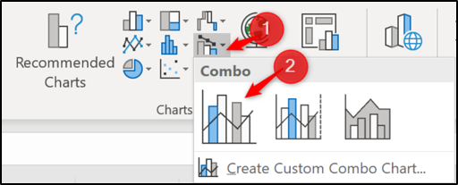
To get started, select the range of cells you want to chart—A1:C13 in this example. Next, click Insert > Insert Combo Chart. Select “Clustered Column – Line.”
The combo chart is inserted with both the column and line using the same axis. Easy as that!
Read the remaining 24 paragraphs
Source: How-To Geek